Visual Explanation of Bayes Rule
Venn Diagram is one of the easiest ways to visualize the Bayes Rule. For that, I take a classical example of computing probability of cancer given the test result is positive.
Anatomy of a Test
- 1% of women have breast cancer (and therefore 99% do not).
- 80% of mammograms detect breast cancer when it is there (and therefore 20% miss it).
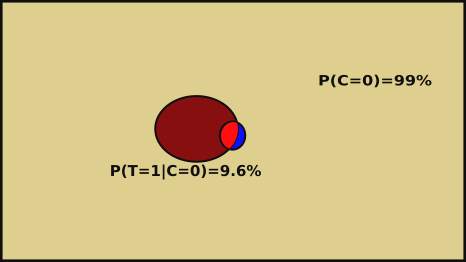
- 9.6% of mammograms detect breast cancer when it’s not there (and therefore 90.4% correctly return a negative result).
Now suppose a person get a positive test result. What are the chances the person has cancer?
80%? 99%? 1%?
It looks like the right hand side of Bayes Formula. COOL!!
Venn Diagram of cancer test information
Area representing women having cancer (C=1) : 
Probability of breast cancer P(C=1) = 1%
Probability of not having cancer P(C=0) = (100 - 1)% = 99 %

Area representing positive result (T) (saying the woman has cancer) P(T=1):

Hence, P(C=1|T=1) =

Visually problem is solved
Using the areas to compute the probability.
80% of women having cancer are identified by test P(T=1|C=1)
= 80% = 
$P(T \cap C)$ = 80% of 1% = 0.8 * 0.01 = 0.008 =
= 
= 0.09504 + 0.008 = 0.10304
Probability of cancer given test is positive $P(C=1|T= 1)$ =
= 0.008/ 0.10304
= 0.0776 = 7.76%
Using Bayes Formula